Email: Bnishio@gmail.com

Project Name:
One World Tales
Group Project
Role: UI UX Lead Designer
User/Audience: Parents & Children
Duration: 3 Week Sprint
Tools & Methods: Figma, ChatGPT, Microsoft Designer & Double Diamond Design Process
The Client's Problem
We're building a company to craft incredible personalized children's products. We require a responsive and engaging e-commerce website to sell our products worldwide.
Our products spark curiosity and respect for different cultures. They help young people grow into caring and knowledgeable global citizens. In a world that celebrates diversity, our books are symbols of inclusivity
The main challenge we faced as a team was creating a website for a product that was being made. Building the design was challenging when we didn’t have an original reference.
The Competition


Task Analysis
To get familiar with the market our team ran a task analysis to understand how other companies had created solutions for the custom book industry. Our favorite features which we were able to walk away with came from Librio and My Heart Books. Librio had a very user-friendly website design with great customization screens! In addition, My Heart Books focused on special needs/disability customization features. We kept these features in mind when we wrote up our initial interviews.
Interviews
-
Upon research and interviews, we found common features that many users looked out for while shopping.
-
Shipping was something that several users found important
-
We also wanted to streamline the checkout process if possible
-
On top of all of this, we tried to discover if we would choose desktop or mobile to design for first.
-
Research was inconclusive with users being equally split when asked if they shop on their desktop or mobile device.
-
We ended up going with Mobile because one of the marketing strategies that we were presented with was through targeted ads on Instagram and Facebook.
-


Persona
We built a persona off of the average of our interviewees. Priyanka would be the user that we were servicing our website for.
The Problem Statement
Priyanka needs a swift way to purchase a gift online with her children that involves them in the shopping experience and helps them feel more represented, proud of their Indian heritage, and connected to their culture.
A User Flow
Was designed so that we could visualize how we may have our users navigate through the website to complete the task of customizing and purchasing a book.
Sketches
After creating the user flows, we ran a design studio where we drew some quick sketches to brainstorm potential frames and features that would be family and kid-friendly. We chose our favorites and talked about what we made them stand out to us so that we could move onto the next phase.

.png)
.png)
First Wireframes
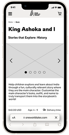
After sketching we built out assets that would be used on multiple pages and I developed a style guide for text that would be used throughout the build.
The next steps were to prototype and get this version ready for testing.
Usability Testing
Scenario: The user sees an ad on Instagram about personalized cultural stories, it catches their interest.
Task: To Customize and purchase a book for their child in which their child is the main character.

1st Round
The first round was run on our V1 prototype. In which we had a 66.67% success rate. The main feedback for this version was that the wording and copy in our first version could be confusing. In addition to this, the wording in our many buttons could be found as misleading.
So much so that one user got caught in a loop and was not able to finish the task.
Reiteration
Upon Reiteration, we added action copy to see if this would engage the user in the hero section, and we changed the wording in many of the frames and buttons to make them more direct and clearer. Hopefully this time we would avoid errors and frustration.
.png)


Round 2
This time around, all users were able to complete the task. We received some feedback on the process such as the customization process had too many screens and there was too much text on other screens now. However, we were headed in the right direction and we were ready to move into our High Fidelity Frames.
Let's bring some color
to these frames!

Moving into the High Fidelity Prototype we recieved some assets for our style guide. One World Tales provided some colors that were to be incorporated in the final design, we received some sketches for our customization pages, and a logo was provided for our header. It felt great to finally have some assets that were dedicated to the final product!
.png)

.png)
.png)
Take Aways
This was a great learning experience! We worked with a very enthusiastic client who was ready to get the ball rolling. The hardest thing about this project was building the UI for an e-commerce website without knowing the style and copy of the final product. With this at hand, we didn't panic but we learned to create an adaptive mobile version for our prototype. In addition to this we were able to use several AI tools to create placeholders that allowed us to build a high fidelity design. Working with this team was a great learning opportunity! I worked on my communication and distribution of tasks to meet deadlines. In addition to all of this, it was great working with experienced members in the field. I will take the lessons learned with me throughout my UI Journey.
